Friday 8 March 2013

Friday 1 March 2013
Thursday 28 February 2013
Sunday 3 February 2013
Monday 10 December 2012
Evaluation Task 4: How did you use media technologies in the construction and research, planning and evaluation stages?
During the past months
I have used many digital technologies such as Google, YouTube, emails etc..
These digital technologies allowed us to experiment in different ways and were
essential in the creation of our products. From the research of envisaging what
we wanted our product to look like all the way to the post production
technologies that enabled us to actually create this product - digital
technologies were a key aid of letting us be creative and able to make the
product that we wanted to.
 The internet was one of
the main digital technologies that we used for the research of our product. We
used Google to look up similar artists to the one we were creating. This was a
female artist who was a singer/songwriter but had an edge. At first we found
Adele, but then we got artists like Delilah and Ellie Goulding which had this
coolness about them and were less classical (something that we wanted our artist
to be like). Once we had found these artists who were in the same genre to our
artist we researched into social networks which allowed us to see the target
audience of these similar artists to our own. These social networks not only
enabled us to see who the target audience were for similar artists but we also
looked into individual fans to see what their interests are as an individual
- this provided us with a deeper understanding as to what
the audiences are about and what makes them like the artist. By looking into
the fans of the artists we found that the target audience was predominately
females. This technology really enabled us to get a deeper understanding into what makes these artists fans like them specifically. They were also of an older audience than teenagers – mainly 17-24 year
olds which shows there should be an element of maturity of the artist, not
really girly and quite ‘cool’. The way that we wanted to create this was by
making her artwork on the website and Digipak quite artistic yet still have a
bit of a singer/songwriter feel. We also looked at demographics on YouTube to increase our understanding of
who our audience would be. (Above is a print screen shot of what we found).
The internet was one of
the main digital technologies that we used for the research of our product. We
used Google to look up similar artists to the one we were creating. This was a
female artist who was a singer/songwriter but had an edge. At first we found
Adele, but then we got artists like Delilah and Ellie Goulding which had this
coolness about them and were less classical (something that we wanted our artist
to be like). Once we had found these artists who were in the same genre to our
artist we researched into social networks which allowed us to see the target
audience of these similar artists to our own. These social networks not only
enabled us to see who the target audience were for similar artists but we also
looked into individual fans to see what their interests are as an individual
- this provided us with a deeper understanding as to what
the audiences are about and what makes them like the artist. By looking into
the fans of the artists we found that the target audience was predominately
females. This technology really enabled us to get a deeper understanding into what makes these artists fans like them specifically. They were also of an older audience than teenagers – mainly 17-24 year
olds which shows there should be an element of maturity of the artist, not
really girly and quite ‘cool’. The way that we wanted to create this was by
making her artwork on the website and Digipak quite artistic yet still have a
bit of a singer/songwriter feel. We also looked at demographics on YouTube to increase our understanding of
who our audience would be. (Above is a print screen shot of what we found).

For the production of our video we used an FS100 for test shots of the two underwater girls. This was to see how the slow motion on the camera worked and to get our actors comfortable with the movements that we wanted them to do. By using the slow motion setting we saw how we could only film in 6 second chunks - then we would have to wait for a few seconds for the clips to transfer into slow motion. This was good for us as directors as it enabled us to be able to be specific in the movements that we told the girls to do - there wouldn't be a moment where they would be like 'oh god, i don't know what to do next' which is something we wanted as we needed their faces throughout to be neutral because if they showed hesitation or any uncertain expression on their face it would be shown in the slow motion setting as everything is seen in such detail. The quality of the FS100 over using a mobile phone for example really helped us envisage what we could make our product look like and how good it would come out. After we had filmed the girls we used Final Cut Pro to edit the movements together onto the track. This was a software we were all familiar with as we used it in the course last year. This technology made it easy for us to view all of the shots that we took quickly. We also used this software when editing our animatic. For our animatic we drew and coloured a very large storyboard. (Here's a picture of me and my group with our large storyboard).

We used the NX5 camera to film the storyboard. After we had filmed each shot for 15 seconds we edited it on Final Cut Pro and adjusted the lengths of each shot to the time of the music we wanted. By being able to create this animatic through these technologies it enabled us to get a feel of what our music video is going to look like. It was good for us to be able to see it visually (in the same way as we are going to be seeing out music video). Doing the tests shots gave an opportunity to experiment in recreating the
underwater effect with the fans and get it right for the shoot day. Also by using the technologies it got us even more confident on using them. It was useful to see what specific shot types we liked - which looked good on the animatic. By seeing the shots in time with the music too it showed us just how important it was that each shot fitted together nicely and that the colours all complimented each other. It showed also the importance of the theme of water throughout and how our video is really about the quality of beautiful shots rather than a narrative or performance element.

Research and planning
 The internet was one of
the main digital technologies that we used for the research of our product. We
used Google to look up similar artists to the one we were creating. This was a
female artist who was a singer/songwriter but had an edge. At first we found
Adele, but then we got artists like Delilah and Ellie Goulding which had this
coolness about them and were less classical (something that we wanted our artist
to be like). Once we had found these artists who were in the same genre to our
artist we researched into social networks which allowed us to see the target
audience of these similar artists to our own. These social networks not only
enabled us to see who the target audience were for similar artists but we also
looked into individual fans to see what their interests are as an individual
- this provided us with a deeper understanding as to what
the audiences are about and what makes them like the artist. By looking into
the fans of the artists we found that the target audience was predominately
females. This technology really enabled us to get a deeper understanding into what makes these artists fans like them specifically. They were also of an older audience than teenagers – mainly 17-24 year
olds which shows there should be an element of maturity of the artist, not
really girly and quite ‘cool’. The way that we wanted to create this was by
making her artwork on the website and Digipak quite artistic yet still have a
bit of a singer/songwriter feel. We also looked at demographics on YouTube to increase our understanding of
who our audience would be. (Above is a print screen shot of what we found).
The internet was one of
the main digital technologies that we used for the research of our product. We
used Google to look up similar artists to the one we were creating. This was a
female artist who was a singer/songwriter but had an edge. At first we found
Adele, but then we got artists like Delilah and Ellie Goulding which had this
coolness about them and were less classical (something that we wanted our artist
to be like). Once we had found these artists who were in the same genre to our
artist we researched into social networks which allowed us to see the target
audience of these similar artists to our own. These social networks not only
enabled us to see who the target audience were for similar artists but we also
looked into individual fans to see what their interests are as an individual
- this provided us with a deeper understanding as to what
the audiences are about and what makes them like the artist. By looking into
the fans of the artists we found that the target audience was predominately
females. This technology really enabled us to get a deeper understanding into what makes these artists fans like them specifically. They were also of an older audience than teenagers – mainly 17-24 year
olds which shows there should be an element of maturity of the artist, not
really girly and quite ‘cool’. The way that we wanted to create this was by
making her artwork on the website and Digipak quite artistic yet still have a
bit of a singer/songwriter feel. We also looked at demographics on YouTube to increase our understanding of
who our audience would be. (Above is a print screen shot of what we found).
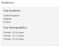
This showed us again that the main fanbase for
artists like Delilah and Ellie Goulding are females aged 18-24. One way which
we wanted to reach out to this (same) audience was by making the three actors in
the video girls of the same age to this audience as this would make them
relatable to our audience. To get an even greater understanding of what these artists are about I researched into their homepages. which became useful when creating our website as we wanted to take conventions from these artists as they have obviously been successful in communicating with the same fanbase. Also by the song that we picked being quite sophisticated
and deep it means that this music is more meaningful and has messages instead
of teenager songs being about a boy (a lovey dovey song). The internet enabled us to look onto YouTube where there are millions of different songs to find one that is specifically what we are looking for.


Early on me and my
group produced PowerPoint’s of our concepts of some of our ideas of what our
video could be about. By using PowerPoint it enabled us to be able to pitch to
our class what our ideas were in a way that was visual and clear to them. It
made it more relevant to the group by presenting them with something right
infront of them as they could grasp a deeper understanding by seeing exactly
what we mean rather than us speaking and them having to imagine it. This makes
the idea more real and shows how it can be achieved as we are backing it up
with (photographic) evidence. Although some of the ideas presented were not
used – for example our main idea at this point was doing a teenage pool party with a girl going underwater and finding this magical world below the water, however in our feedback the group said that the idea of a teenage pool party contrasted
with dreamy underwater shots was a bit of a clash and led us to go down the route of a singer/songwriter yet trip-hop track. This technology enabled us to get feedback from the group and they steered us in
the direction of something else which allowed us to change the idea and move
on. For looking at existing products YouTube was a great place for us to
research. Not only were we able to find similar artists music videos but we
were able to find videos which we could use to inspire us – having the same
themes in their video to our idea. Once we had decided to do a video underwater
we typed into YouTube ‘Underwater Dance’ to see what would come up. After
scrolling and watching many we came across one which looked spectacular and
magical – both aspects we wanted in our video. This video had effects layered on top which is something we wanted to also experiment with. We then found other separate
videos showing how this video was achieved and YouTube gave us the platform to
look into videos similar to this so we could create a product as effective. This not only showed us that we could do it but it
was also a great influence that provided us with confidence and motivation to
get a product as amazing looking as the one that we found.
We also used
YouTube to look at the artists similar to ours videos. For example we looked at
Ellie Gouldings. But we also looked at Cheryl Cole – who is a female artist
with a similar target audience to ours (although her music might be very
different). In her music video ‘The Flood’ it explored a similar theme to ours
– water. Because of this video being kind of like a dream as many shots are
taken of her in her bed – we decided to make ours dream-like. Although we
discussed the idea of having the bed at the beginning and end of our music
video we wanted to make it a bit more open ended for the audience and more
abstract so decided to not show these shots. Also by looking at this video we
saw a shot that we really wanted to echo. This was of two hands (below is a picture we took experimenting with this idea from Cheryl music video). We used
this as an influence of how the singer could enter the water with the other two
girls. Although we might not have used it exactly in the same way it definitely
gave us the idea of having the singer enter in a way which brings all of the
girls together.

To get in contact with
our actors I used different digital technologies. I used mainly texting as it
was quick and easy and I knew that all of them would check their phones before
they checked their emails. Also I knew that if they replied I would get their
message straight away therefore if there were any problems we would know. Also
texting was a way to communicate with my group when we were apart – this was
for example when we were thinking about our schedule and what time we should
bring the girls in. We also created a WhatsApp group so that we could have
group discussions together about the shoot day, actors or anything that we
wanted to talk to each other about concerning our products. This was quicker
than sending emails and it made sure that we were all in the loop. I feel that
this digital technology that we used was very beneficial as it really enabled
us to have good team work. 

For the production of our video we used an FS100 for test shots of the two underwater girls. This was to see how the slow motion on the camera worked and to get our actors comfortable with the movements that we wanted them to do. By using the slow motion setting we saw how we could only film in 6 second chunks - then we would have to wait for a few seconds for the clips to transfer into slow motion. This was good for us as directors as it enabled us to be able to be specific in the movements that we told the girls to do - there wouldn't be a moment where they would be like 'oh god, i don't know what to do next' which is something we wanted as we needed their faces throughout to be neutral because if they showed hesitation or any uncertain expression on their face it would be shown in the slow motion setting as everything is seen in such detail. The quality of the FS100 over using a mobile phone for example really helped us envisage what we could make our product look like and how good it would come out. After we had filmed the girls we used Final Cut Pro to edit the movements together onto the track. This was a software we were all familiar with as we used it in the course last year. This technology made it easy for us to view all of the shots that we took quickly. We also used this software when editing our animatic. For our animatic we drew and coloured a very large storyboard. (Here's a picture of me and my group with our large storyboard).

For the post production of our
video we used Final Cut Pro which was a piece of computer software that we used
in the AS course to cut our thriller video. On this we firstly created ‘bins’
for each of our shots. For example we had a bin for ‘lip syncs’, for ‘2 girls
underwater’ etc.. This enabled us to quickly see each of these specific shots
and not get confused. We decided to start with a shot from outside of the water
which we took by the pond. We didn’t know whether to change this shot to slow
motion but decided not to because this would make the slow motion shots of the
girls more significant. By having this technology not only could we organise
our files really clearly but also we could watch over any changes we had done
whether that being every time we added a shot to our timeline. We used the
blade tool, we made sure that the shots connected with each other and one way
that we did this was using cross dissolves for the transitions between shots.
The cross dissolves creates the illusion of floating between the shots. We didn’t do this every time because we didn’t want it to look like a
slideshow. However this technology allowed us to create a really magical
effect. In aftereffects we added particles and bubbles to the mouths of our
girls. This was so that our video really looked like it was filmed underwater.
By added these subtle yet powerful aftereffects it completely transformed our product
and really added to the dreamlike effect that we wanted throughout the video.


We used aftereffects, the programme we used was called 'Motion'. This enabled us to add particles in the background, lighting which looked like reflections from the sky, but most importantly it was used for bubbles - which made it look like it was underwater. This allowed us to completely transform the video from an visual video to an underwater visual video.
For research and planning of the Digipak we looked at similar artists to
see what conventions were used in the artwork of artists who have a similar fanbase
to ours. We looked at artists such as Ellie Goulding and Delilah. During the
planning for the artwork we had a brainstorm of the words that we wanted our
album cover to convey. We wrote these out on the board and I took a picture on
my phone so that I could look and see the words at all times so that whenever I
thought of a photo shoot idea for the artist I could see if it really went well
with the words that we came up with. These were ‘sophisticated, modern, cool,
thoughtful, mature, edgy’. Having this image on my phone was significant as
this technology enabled me to (at the photo shoots and planning for them) keep
focused on exactly what photos we are all looking for for this product. For the
production of the artwork I did two photo shoots with Georgie. The first was on
our shoot day - when Georgie wasn’t needed me and her had a photo shoot. I kept
her in front of the fans and took different photos – some natural looking, some
posed. I decided whilst taking pictures and looking at them on my camera (Nikon
D3100) that the more natural (less posed) photos were more affective so this allowed
me to quickly make her do the more natural looking photos instead of wasting
time by taking photos that wouldn’t be used. The second photo-shoot I set up in
the studio a white backdrop as this created a totally white background. After
taking some standing up ones I decided to get Georgie lying down. The post
production was where these images turned from an ‘ok photo’ to two really cool
images that go together to make the panels inside of the DigiPak. I used
PhotoShop and Picasa3 to edit my photos from both of the shoots. From the shoot
1 images I created the album front and back. For the back image I got a photo
of Georgie that I cropped the hair out of so that it was the size of the back
of the Digipak – this was because hair was an important element of our video so
had a link with that, but also it created the illusion along with the front
cover that it was all one image. This added texture to the back of the cover.
After it had been cropped on Photoshop to size, I saved it and edited it in
Picasa3. By using this editing programme I firstly changed the colour to black
and white changed the contrast and brightness as we wanted the colours to be a
bit more edgy and dark but still having the shadows visible. After I had done
this I opened this file onto the Digipak template that I had on Photoshop. I
added the track list onto a layer on top of this using the Text tool – when using
this I created a box to write inside of which enabled me to make the font
bigger and smaller but keep the same proportions (e.g not make the writing
flatten). Initially this writing was white but after the feedback session we
had everyone said that it would look more affective if the writing was blue as
it is more modern and less classical and serious and it also went with the ‘underwater
feel’ of the video. Photoshop was great because of the layers which meant that I
could save the image as a Photoshop document so that the next time I wanted to
go onto the file I could make changes I could without having to start again (this
is instead of saving as a Jpeg which wouldn’t allow you to make changes to it).
This made it very easy and quick to make changes when we wanted to change the
product in any way. Then for the front cover I only used Photoshop. Once we had
decided which photo to use I edited it to black and white. Unlike the back
cover process - for this I didn’t use a ‘one click solution’ to get black and
white, instead I used a tool which enabled me to change the tones of each
colour in the photo to black and white – this tool is under adjustments named ‘Black
and White’.

After doing this I then wanted to make Georgie's skin look flawless. I
used a retouching tool called the ‘spot healing brush tool’ and ‘clone stamp
tool’ to do this. These are both very easy to use, all I had to do was make a
mark where I wanted the retouch to work and it did it in one click. I then like
the back cover adjusted the brightness and contrast to match it. The text on
this particular image was the hardest because of the complexity of it. After
looking at Ellie Gouldings album covers we saw that she had writing that
glowed. This was something we wanted an element of on our front cover. The way
that I could do this was firstly typing out the writing that we wanted on the
front – also making it the write font, size and colour. Once this was done I duplicated
the layer three times. The first duplication layer I left (didn’t move or
change is anyway) so this made the font a bit more prominent. The second duplication
layer I blurred – using the ‘blur tool’ which is in the toolbar to the left of
Photoshop and has a teardrop as the icon but I also moved this layer slightly
to the left of the other layers so that this created an almost side shadow. The
third duplication layer I added the glow affect to which was a tool that I
found under filters called ‘neon glow’.
Before using this I ‘rasterized the text’ which turned it from a bit of text to
more of an image which can be edited on. After the font was done.


For the two inside panels I used a bit of both – Picasa3 and Photoshop.
Firstly I used Picasa to edit the image. I firstly change the image to black
and white, then adjusted the brightness so that it made the background very
white and then I added shadows with the contrast to make quite an
impressionistic image. I then opened this image in Photoshop after I had saved
it (as a different Jpeg so that I kept the original just in case we later
decided we didn’t like the changes I made to it). In Photoshop I cropped the
image into a square – this changed the image dramatically as I only focused on
the face and hair (getting rid of any of her body). I then decided to open up
another Photoshop document with a blank template on it so that I could layer
this image onto it. After doing this I decided to mirror the image so that it
went across two panels. The way that I mirrored the image was by opening up the
image in another document and clicking on image/image rotation, and using the
tool ‘flip canvas vertical’, followed by ‘flip canvas horizontal’, then ‘flip
canvas vertical’. This created a mirror image of the original cropped image. Once
I had done this I realised that the two images together actually created a
heart with her hair due to the position of it. This worked really well
surprisingly and created an interested two panel spread. Although this may
sound like quite a confusing process it was pretty simple because of the
technology that I had to create it. Without Photoshop and Picasa I wouldn’t
have been able to change the original images into something expressionist. This
wouldn’t have been as affective as it meant that I had no manipulation apart
from the way that I were to take the photo. This meant that if we wanted it to
be black and white it was very easy to do but just as easy to undo (by saving
different files).


Subscribe to:
Posts (Atom)